The dashboard: what each panel answers
What the executive summary, alerts, store health and the other panels are for, and how to choose which appear and in what order.
The report is one day. The dashboard is the pattern: every site, over a range of days, with what is unusual pulled to the top.

Choosing the range
- Open Dashboard from the toolbar.
- Pick the range: 7 days, 30 days, month to date, year to date, or everything.
- Filter by kind of site if you have both shops and kitchens.
- Switch on exception mode to hide every site that needs nothing from you today.
The panels you will use most
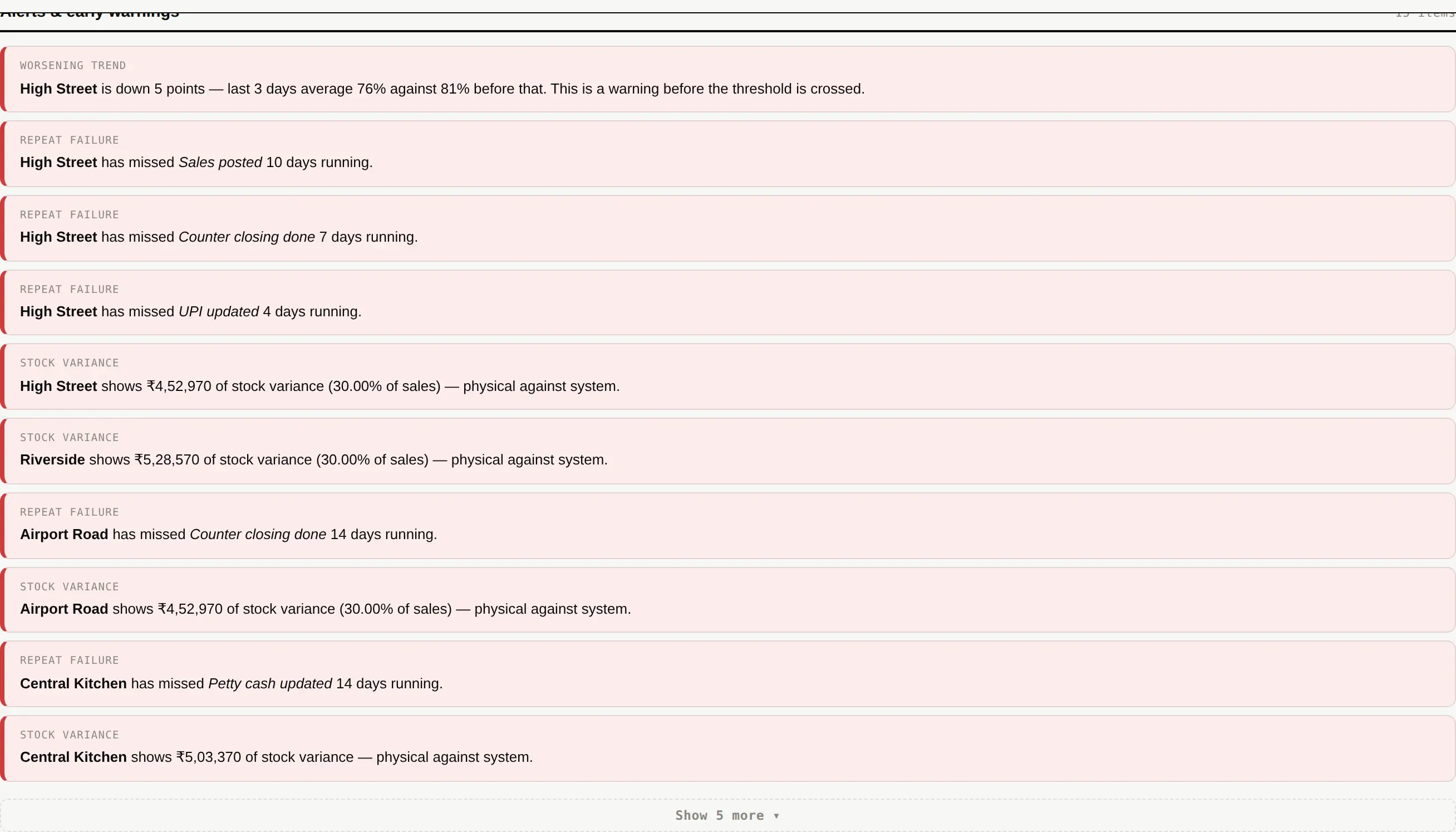
| Executive summary | One line per site: score, days audited, what is wrong. |
|---|---|
| Performance trend | The score of every site over time. See Process signals for the second way of reading it. |
| Alerts & early warnings | Everything that crossed a limit or is heading that way. Sorted worst first; long lists fold, and the serious items are never the ones folded away. |
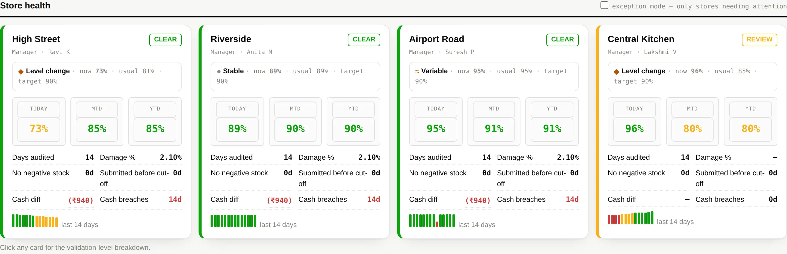
| Store health | One card per site with today, month and year beside each other. |
| Corrective actions | What is open, overdue, and repeating. |
| Audit calendar | Which days were audited and which were missed. |
Which panels appear, and in what order
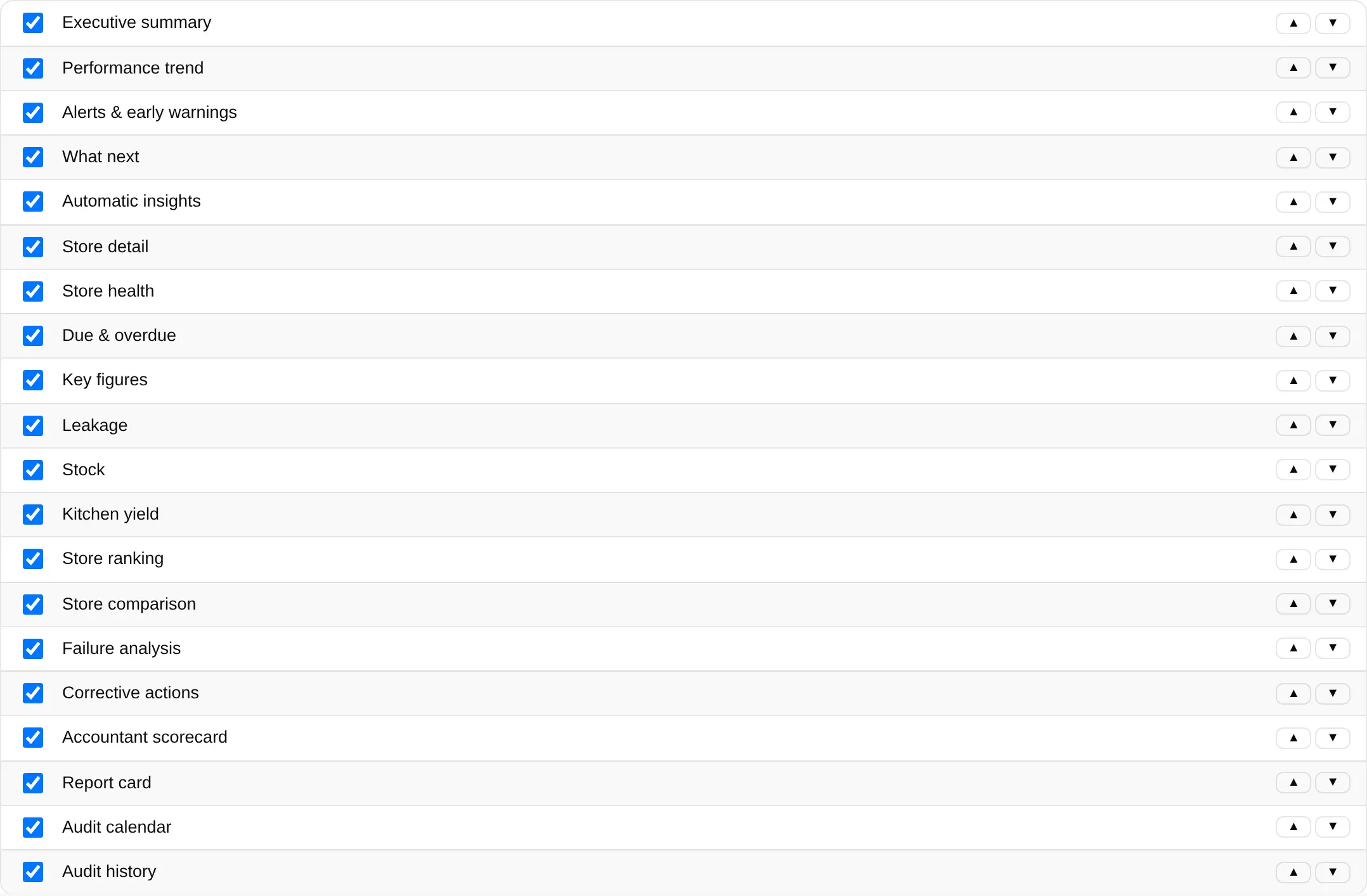
- Open Settings ▸ Dashboard.
- Untick a panel to hide it. Nothing is deleted — tick it again and the figures are still there.
- Use ▲ and ▼ to change the order. The dashboard, the PDF and the image all follow it.